Close Menu
    Facebook X (Twitter) Instagram
    GadgetFreeks
    • About
    • Streaming
    • News
    • Blog
    • Gaming
    • Name Generators
    • Write For Us
    • Contact
    GadgetFreeks

    GadgetFreeks

    Game Generator

    Fortnite Game Name Generator

    Roblox Game Name Generator

    PUBG Name Generator

    League of Legends Name Generator

    Dota 2 Name Generator

    Counter Strike Name Generator

    Blog

    Brandmydispo Reinventing Customized Mylar Bags Blog

    How Brandmydispo Is Transforming Custom Mylar Bags

    By Joseph NgoSeptember 6, 20260
    Why Case Battles Became the Go-To Mode for Skin Wagering Blog

    How Case Battles Became Popular for Skin Wagering

    By Joseph NgoSeptember 25, 20260
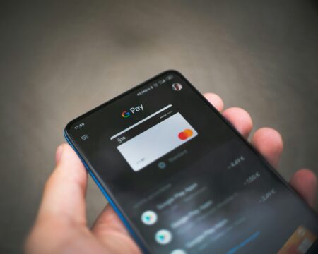
    What Small Digital Payments Reveal About User Experience Image soure: Unsplash Think about the steps involved in making a small purchase online. A user may need to create an account, enter personal details, select a payment method, complete verification and wait for confirmation. Each step may serve a legitimate purpose, but together they can make a modest transaction feel unexpectedly complicated. That makes low-value payment flows an interesting subject for user-interface designers. They offer a compact way to examine how clearly a website presents prices, terms, forms and transaction feedback. The monetary amount may be small, but the interface still needs to explain exactly what the user is authorising. A good checkout does not simply remove as many screens as possible. It balances convenience with security, transparency and the information required to complete the transaction correctly. The Interface Should Match the Task Digital payments appear in many types of products. App stores process software purchases, streaming platforms collect subscription fees and transport apps charge for individual journeys. Other services sell digital content, event tickets, game items or temporary access to premium features. These transactions do not all require identical information. A physical order needs a delivery address, while a digital download usually does not. A recurring subscription must explain its billing schedule, whereas a one-time purchase needs a clear final total. Problems arise when a standard checkout is copied from one service to another without considering those differences. A form can then request information that has no obvious connection to the purchase. Even when the data is genuinely required, the absence of an explanation may leave users wondering why they are being asked for it. The better design question is therefore not merely “How short can this form be?” It is “What does the user need to understand and provide at this stage?” Budget Filters Need Supporting Information Price is one of the most visible ways to organise online products. Retail websites allow shoppers to set minimum and maximum amounts, while subscription platforms commonly separate plans by monthly cost. Specialist comparison pages can use the same principle. A page about a 10 euro deposit casino, for example, groups a particular category of entertainment platforms around a stated deposit threshold. This is one narrowly defined use of price-based filtering rather than the subject of digital payments as a whole. A monetary threshold can make a large selection easier to navigate, but it does not provide a complete assessment of a service. Users may still need information about transaction fees, recurring charges, account requirements and the conditions attached to payments. The same applies outside entertainment. A software plan advertised below €10 may be billed monthly or annually. A low-priced product may carry delivery charges. A free trial may convert into a paid subscription after a specified period. An interface should display these distinctions before the user reaches the final confirmation. Clear Labels Reduce Guesswork Checkout screens need language that describes what will happen next. A button labelled “Continue” does not reveal whether it opens another screen or completes a purchase. More specific text, such as “Review order” or “Pay now,” gives the user additional information about the consequence of pressing it. The total price should also remain visible. If taxes, service charges or delivery costs apply, displaying them only at the final moment can change the user’s understanding of the transaction. Forms benefit from the same clarity. Related fields can be grouped together under recognisable headings, such as contact information, billing address and payment method. Required and optional fields should be distinguishable without forcing the user to submit the form first. The Nielsen Norman Group identifies structure, transparency, clarity and support as four principles for reducing cognitive load in forms. Its guidance explains that every field asks users to interpret a question, retrieve information and enter it in an accepted format. Grouping related fields and providing constructive error messages can make that work easier to complete. Feedback Should Follow an Action A digital interface should acknowledge when a user taps a button or submits a payment. Without visible feedback, the user may not know whether the request is being processed. That response does not require an elaborate animation. A disabled payment button, progress indicator or short processing message can show that the system has registered the action. Once the transaction finishes, the interface should clearly state whether it succeeded or failed. Error messages are most useful when they identify the problem and suggest a next step. A general “Something went wrong” message provides little assistance. A message explaining that a required field is incomplete, a card has expired or the connection was interrupted gives the user something specific to address. The location of the message matters as well. Placing it beside the relevant field makes the connection visible. If it appears only at the top of a long page, the user must search for the input that needs attention. Consistency Supports Recognition Payment flows often move between several systems. A customer may begin in a retailer’s app, continue on a payment provider’s screen and approve the transaction through a banking application. Those transitions are sometimes necessary, but they should be explained. An unexpected change in layout, address or branding can create uncertainty about where the user has been sent. A short notice identifying the next step helps preserve context. Familiar placement also matters. If primary and secondary buttons change position between screens, a quick tap can produce the wrong action. Consistent labels, colours and navigation allow users to apply what they learned on the previous screen. GadgetFreeks has previously examined how interface choices shape digital interaction in UI, UX and Interactive Play: How Modern Software Architecture Keeps Users Hooked. Payment design belongs to the same wider discussion about software architecture, although its purpose is more specific. A checkout must communicate financial consequences clearly rather than merely encourage continued engagement. Mobile Checkout Requires Practical Testing A checkout that works on a desktop monitor may behave differently on a phone. The on-screen keyboard reduces the available space, autofill may enter information in an unexpected format and switching to another application can interrupt the original session. Testing on physical devices can reveal issues that are not obvious in a static design. Developers can check whether fields remain visible above the keyboard, whether buttons are large enough to tap and whether the transaction continues correctly after identity or banking verification. Connection quality should also be considered. If a response is delayed, the interface needs to distinguish between a transaction that is still processing and one that has failed. Repeated payment attempts should not be encouraged when the status of the first attempt is unknown. Terms Should Appear Before Confirmation A low initial price does not automatically mean that a transaction has simple conditions. The payment could activate a subscription, include an introductory rate or depend on an account remaining active. Important terms should therefore appear before the user confirms. For a recurring payment, that includes the amount, billing frequency and next charge date. For a trial, the interface should identify its duration and explain what happens when it ends. Cancellation information should also be reasonably accessible. Users should not have to complete a purchase before discovering how a recurring service can be stopped. These details are part of interface quality because they affect the user’s understanding of the action. A technically functional payment screen can still communicate poorly if the price structure is incomplete or difficult to find. A Proportionate Payment Experience Small digital payments do not require careless design simply because less money is involved. The user still needs to recognise the service, understand the total price, select the intended payment method and receive confirmation of the result. The strongest payment flow is not automatically the shortest. Necessary verification, security checks and legal information may require additional steps. What matters is that every step has a clear purpose and that the interface communicates that purpose effectively. Low-value transactions provide a focused environment in which to assess those choices. They reveal whether forms request relevant information, whether charges are visible and whether the system responds clearly after an action. When those elements work together, even a multi-stage payment can remain understandable from the first screen to the final confirmation. Blog

    What Small Digital Payments Reveal About User Experience?

    By Joseph NgoSeptember 17, 20260
    What Makes Crypto Mining Hardware Different From Standard Computers Blog

    What Makes Crypto Mining Hardware Different From Standard Computers? 

    By Joseph NgoOctober 9, 20250
    The Rise of Mobile Gaming Blog

    The Rise of Mobile Gaming: Are Consoles Losing Ground?

    By Joseph NgoSeptember 25, 20250
    Crypto market cycles: Does the 4-year pattern still hold today? Blog

    Crypto Market Cycles: Does The 4-Year Pattern Still Hold Today?

    By Joseph NgoAugust 5, 20260
    Beyond the Games How iGaming Tech is Supporting the Digital Economy Blog

    Beyond the Games: How iGaming Tech is Supporting the Digital Economy?

    By Joseph NgoSeptember 17, 20260
    After The Merge The Honest Guide to Getting Free Ethereum Blog

    After The Merge: The Honest Guide to Getting Free Ethereum

    By Joseph NgoSeptember 16, 20260
    Load More

    Gaming

    The Nerve-Wracking Rise of Casino Crash Games

    How Crash Games Are Changing Online Casino Gaming

    By Joseph NgoSeptember 11, 20260

    How Crash-Style Games Became Popular Among Tech Gamers

    By Joseph NgoSeptember 11, 20260
    The Rise of Decentralized Crypto Mining: Home Miners Redefine Bitcoin's Future

    Why Home Miners Are Bringing Decentralized Crypto Mining Back

    By Joseph NgoSeptember 11, 20260
    Choosing The Right Online Casino Site For You

    What to Look for When Choosing an Online Casino

    By Joseph NgoSeptember 21, 20260
    How gaming and digital currency are merging in mobile apps

    How Crypto and Mobile Gaming Are Coming Together

    By Joseph NgoSeptember 27, 20260
    The Best Online Games Everyone Keeps Playing

    The Best Online Games Everyone Keeps Playing

    By Joseph NgoMarch 6, 20260

    What's New?

    The Tools Travel Sites Use to Find the Cheapest Fares

    October 15, 2026
    Blockchains Are Still Evolving And Changing Tech Landscapes 

    Blockchains Are Still Evolving And Changing Tech Landscapes 

    February 12, 2026
    Building a sound effects library for faster tech review edits

    Building A Sound Effects Library For Faster Tech Review Edits

    September 8, 2026
    No-KYC Benefits Anonymity in the Digital Age

    No-KYC Benefits: Anonymity in the Digital Age

    August 28, 2026
    Translating Real-Time Data Design to Consumer Tech and Gadget Media

    Real-Time Telemetry and Low-Latency UX: What Live Sports Streaming Teaches Modern Tech Platforms

    August 20, 2026
    How Mobile and Browser Games Use Habanero-Style Rewards to Keep Sessions Short

    How Mobile and Browser Games Use Habanero-Style Rewards to Keep Sessions Short

    August 19, 2026
    How Modern Gadgets Are Changing Personal Safety

    How Modern Gadgets Are Changing Personal Safety

    August 14, 2026
    How Lab-Grown Diamonds Are Made And Why It Matters for Custom Rings

    How Lab-Grown Diamonds Are Made And Why It Matters for Custom Rings

    August 13, 2026

    Movie Streaming

    Strims World: Your Ultimate Guide to Streaming Platforms In 2026

    Movie Streaming

    Mario Movie 3D: Revolutionizing Animation and Storytelling In 2026

    Movie Streaming

    Bestmovies888: Your Ultimate Guide to Top-Rated Films In 2026

    Moviezaddiction Movie Streaming
    Movie Streaming

    Moviezaddiction: Get The Best Alternatives For Moviezaddiction In 2026

    BestWap Movie Streaming
    Movie Streaming

    Bestwap (2026): Best 4+ Best Alternatives For BestWap

    GadgetFreeks
    Facebook X (Twitter) Instagram Pinterest
    • Name Generators
    • Blog
    • Privacy Policy
    • Sitemap

    Type above and press Enter to search. Press Esc to cancel.